Following the path of editing basics it’s now time to work on saturation. You must know that before adjusting color intensity, one thing makes saturation decisions much easier: clarity.
When images are scattered across folders, drives, or catalogs, editing often becomes rushed and reactive. Photo organizer like Peakto help photographers bring their images together and decide what’s worth editing first—so saturation becomes a deliberate choice, not a reflex.
Quick Answer : What is Saturation?
In photography, saturation refers to the intensity of colors—how vivid or muted they appear.
Increasing saturation makes colors stronger and more vibrant; reducing it makes them softer and closer to gray.
Used with intention, saturation helps balance realism, mood, and visual impact.

What Saturation in Photography Really Means ?
So we just said, saturation describes how pure and intense a color appears.
- High saturation results in vivid, strong colors
- Low saturation produces muted, subtle tones
And at zero saturation, all color disappears and the image becomes grayscale. Saturation is one of the three core components of color, alongside hue and brightness.
Because our eyes respond strongly to color intensity, saturation plays a major role in how emotional, realistic, or stylized a photo feels.

Why Saturation in Photography Matters in Your Editing Workflow ?
You understood, saturation affects how viewers feel an image before they analyze it. For example in portrait photography :
- Too much saturation makes colors look artificial, exaggerates skin tones and distracts from the subject
- Too little saturation makes images feel flat or lifeless, it reduces emotional impact and make photos feel distant or dull.
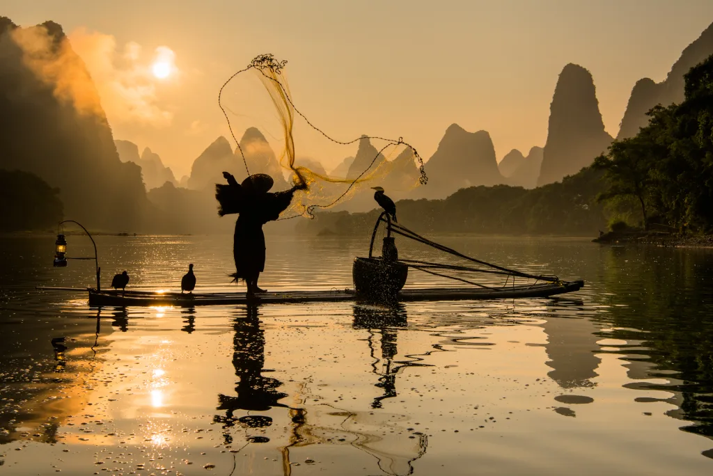
A colorful travel scene may benefit from richer saturation, while a moody portrait or minimalist image often gains strength from restraint. Saturation helps define how loud or quiet an image feels emotionally.
This is why saturation is adjusted as part of editing basics, usually after exposure is stable and color casts are corrected through white balance editing—not as a first fix.
Saturation in Photography: Tools and Techniques
Most photo editors offer two main controls for color intensity.
Saturation
Vibrance
A Practical Approach
Start with very small saturation changes. If colors still feel uneven, use vibrance before pushing global saturation.
Always check skin tones and neutral areas after each adjustment—if whites or grays start leaning toward strong hues, saturation is probably too high.
When to Increase and When to Reduce Saturation in Photography ?

More saturation isn’t always better.
Hold back on saturation when:
- editing portraits (to preserve natural skin tones)
- working with fog, haze, or pastel scenes
- aiming for a timeless or minimalist look
Increase saturation carefully when:
- color is central to the subject
- lighting is soft and colors feel muted
- you want to enhance energy or atmosphere
Knowing when not to add saturation is a clear sign of experience.
Saturation, Exposure, and the Histogram Connection
Saturation doesn’t change brightness—but it interacts with exposure.
Before adjusting saturation, many creators glance at the histogram in photography to ensure exposure is stable. If highlights are clipped or shadows crushed, boosting color intensity can hide detail or exaggerate contrast.
This is why saturation adjustments are easiest to judge once exposure is under control.
How Saturation Interacts with Contrast and Color Balance
Saturation doesn’t work in isolation.
After contrast editing, colors often appear stronger without increasing saturation. Correct white balance editing also prevents saturation from amplifying unwanted color casts.
That’s why saturation is usually refined after exposure, white balance, and contrast—when the color foundation is stable.
Knowing the right tools and techniques for photo editing can significantly enhance your work. If you would like to turn your passion into a career, consider exploring jobs that align with your photography or photo editing expertise and take the next step toward building a career you love.

Saturation and Your Tools
Color decisions depend on what you can see.
Reliable saturation editing is easier with:
- consistent top photo editing software
- a calibrated display
- a smooth system—often leading photographers to look for the best computer for photo editing
Good tools don’t make creative decisions—but they make subtle decisions possible.
Saturation as a Finishing Decision
Saturation in photography isn’t about making colors louder—it’s about making them right.
When exposure, white balance, and contrast are solid, saturation becomes a finishing decision instead of a rescue tool. At that point, even very small adjustments can have a strong impact.
Saturation is adjusted on nearly every professional edit—often in tiny increments rather than dramatic moves.
As photographers gain confidence, they move from fixing color to shaping it, and naturally begin exploring deeper pro tips for photo editing to refine their style.
Saturation doesn’t define your image on its own—but it decides how your colors speak.
FAQ — Saturation in Photography
What is saturation in photography?
It’s the intensity of colors in an image, from muted to vivid.
What’s the difference between saturation and vibrance?
Saturation affects all colors equally; vibrance boosts weaker colors and protects skin tones.
Should I always increase saturation?
No. Saturation should match the mood and subject—not every image benefits from stronger color.